Case study · Concept build
Olive & Ember
A complete restaurant website — menu, story, gallery and a working reservation demo — designed, written and built end to end for a fictional Austin restaurant. The restaurant does not exist; the page says so everywhere it matters.
- Type
- Self-initiated concept
- Status
- Live demo on this domain
- Role
- Design, copy & development
- Stack
- HTML, CSS, JavaScript
Overview
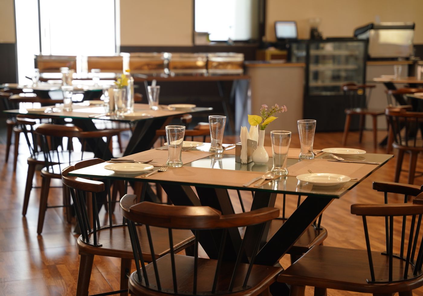
Olive & Ember is a single-page marketing website for a seasonal American restaurant in Austin, Texas. It has a full menu with prices and dietary labels, a story section, a photo gallery with a keyboard-accessible lightbox, opening hours, visit details and a reservation flow that validates input and then explicitly tells the visitor that nothing was sent.
Everything about the restaurant is illustrative: the name, address, phone, email, menu, prices, hours and story are invented for the design. That is disclosed in the footer, the menu, the story, the visit section and the reservation dialog — because a portfolio piece that pretends to be a real business is worse than one that is honest about what it is.
Context and problem
Self-initiated work has no client, no brief and no deadline, which is exactly why it tends to fall apart halfway through. I wanted a project with enough real-world complexity to force decisions: lots of content, several navigation paths, a form, images, mobile layouts, and accessibility requirements that can’t be retrofitted at the end.
The underlying problem I chose is a common one: a small hospitality business needs a website that answers four questions on a phone in under a minute — what is this place, what does it serve, when is it open, and how do I book — without making any of those questions hard to reach.
Objective
Ship one complete, production-quality static site that could be handed to a real small-business owner without embarrassment: fast on mobile, keyboard-usable, readable without JavaScript, and honest about the parts that are demo-only.
My role
Solo on the whole thing: information architecture, interface design, copywriting, front-end build, content sourcing and licensing, accessibility checks, and cross-viewport testing. No framework, no build step, no collaborators.
Constraints and decisions
- No framework, no build step. Plain HTML, CSS and JavaScript so the result is portable, auditable and fast to load — and so the constraint was shipping, not tooling.
- Fiction stays labelled. Placeholder details are shown as placeholders rather than quietly filled with plausible fakes. The reservation dialog states that nothing is sent before you type anything.
- Accessibility from the start. Semantic landmarks, a skip link, visible focus rings, labelled controls,
aria-expandedon the mobile menu, a native<dialog>for the lightbox, and every animation gated behindprefers-reduced-motion. - Licensed photography, credited on the page. Images come from Pexels under the Pexels License, with credits printed under the menu in a disclosure block.
- Images sized, not just optimised. Every image declares
width/heightor an aspect ratio, below-the-fold photos are lazy-loaded, and the hero loads withfetchpriority="high"so the layout does not shift while it arrives. - Reads without JavaScript. The menu, hours and story are plain HTML; JS only adds the lightbox, the reservation demo, scrollspy and reveal animations.
Execution
The build is one HTML document, one stylesheet organised as tokens → base → components → sections → responsive breakpoints, and one script containing a single IIFE.
- Split hero with copy left and a full-height photograph right, stacking image-first on mobile.
- Menu section with a sticky category rail, dotted price leaders, dietary chips, and a hover preview card per dish on pointer devices only — the list stays plain text on touch screens and for screen readers.
- Gallery as a charcoal mosaic with a native
<dialog>lightbox: Escape and backdrop close it, arrow keys move through images, focus returns to the trigger. - Reservation flow using a native dialog, date minimum set to today, inline validation with
aria-invalidand visible messages, and a success state that says plainly that no booking was created. - Responsive work across four breakpoints (1023 / 899 / 640 / 360 px), verified at 390, 768 and 1440 px with no horizontal overflow and no console errors.
Results and current status
The site is live on this domain as a demo and reachable from the homepage. It has no users, no revenue and no client outcomes, because it is a concept — I am not presenting it as anything else.
What is verified: the page renders and functions with no console errors at mobile, tablet and desktop widths; navigation, the lightbox and the reservation dialog are operable by keyboard; and the layout does not shift as images load. Performance and accessibility scores from an automated audit are recorded alongside this project’s implementation notes.
Lessons learned
- Honesty is a design constraint, not a disclaimer. Deciding up front that every fictional detail would be labelled changed the copy, the form states and the footer — and made the whole thing easier to write.
- The interesting problems appear at the edges. The hero was straightforward; the menu preview on hover vs. touch, focus management in the dialog, and keeping content readable without JavaScript took most of the thinking.
- Scope creep is the real risk in self-initiated work. Writing the brief first, then refusing features that didn’t serve it, is what got this finished instead of abandoned.
Next steps
- Wire the reservation flow to a real booking provider and remove the demo-only language, the day a real restaurant client exists.
- Replace the licensed photography with the client’s own images and re-check contrast if the brand palette changes.
- Re-run the accessibility and performance audits at each significant content change rather than assuming they still hold.
Want the same rigour on a real product?
Get in touch